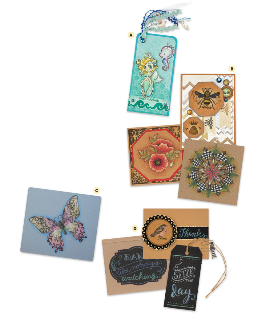
Working on colored paper is what colored pencils do better than markers! The shading, blending, and layering are the same as on white paper, but the finished drawings have a different dynamic to them. I usually add a halo around the colored image to make it pop off the page—light, dark, or matched to the paper underneath, a soft halo rendered with crosshatching, scumbling, or simple shading adds a nice touch.
A. Mermaid Tag: These aquatic cuties were stamped with black ink on light green cardstock. They were then colored and trimmed, leaving a slight edge.
B. Queen Bee Card, Poppy Card, and Zendala: These pieces are examples of stamping and drawing on kraft paper. Note the difference between the light yellow halo around the bee panel and the darker brown halo around the poppies. The light shades in the poppy card were important to make the florals stand out. A basic shading was used on the zendala, with a white gel pen providing dramatic accents.
C. Pastel Butterfly Panel: Pale tones were used to color the black ink butterfly, including a pale blue for the halo.
D. Blackboard Cards and Tag: Blackboard chalk lettering inspired these samples. Use very pale tones on black cardstock.


