

Deciding what colors to use is one thing every project has in common. It is also an area in which many of us have the least amount of confidence. Color surrounds us and plays a major part in our lives; it creates impressions and elicits responses. The average person can see 1 million different colors and the trained eye up to 10 million. Just by working with color, you can start to train your eye to see more colors.
Deciding what colors you want out of the millions possible becomes an awesome task. Color theory itself encompasses a multitude of definitions, concepts, and design applications, and fills several encyclopedias! However, everyone can learn the basics about color. The easiest way to begin is to learn about the color wheel and some general color terms. It’s good to know how to “talk color” to give you some idea of where to start when blending and adding color to your projects.
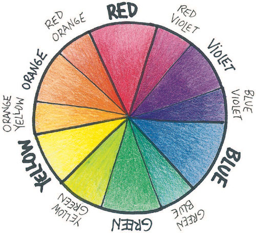
Colors can be divided into four groups:
• Primary Colors: red, yellow, and blue. These cannot be mixed with other colors. All other colors are derived from these three.
• Secondary Colors: orange, green, and purple. The three primary colors are mixed to form this second tier of color. Red and yellow make orange, yellow and blue make green, and blue and red make purple.
• Tertiary Colors: mixing one primary and one secondary color makes these colors. Examples include yellow-green, blue-green, and blue-purple.
• Quadric Colors: mixing two tertiary colors makes these colors. Examples include russet, cinnamon, citron, olive, forest, and eggplant.
To add further nuance, all colors can then be mixed further:
• Tinting, by adding white
• Toning, by adding gray
• Shading, by adding black
Color Terms
It’s good to be familiar with the following basic color terms.
Hue refers to, and is another name for, color. For example, a red-patterned bowl has a red hue.
Chroma refers to the intensity of a color, how bright or dull it is. Scarlet red and brick red are similar in value, but their chroma, their intensity, differ. Brick red is duller, with a lower chroma than scarlet. Scarlet is more brilliant, with a higher chroma than brick red. Colors with low chroma have more other colors added to them; those with high chroma are purer.
Value describes the darkness or lightness of a color. A color that is light in value has been diluted with white. For example, pink is a tint of red and has a light value. A dark value color is closer to black on the scale because it has black added to it. For example, burgundy is a shade of red with a dark value.
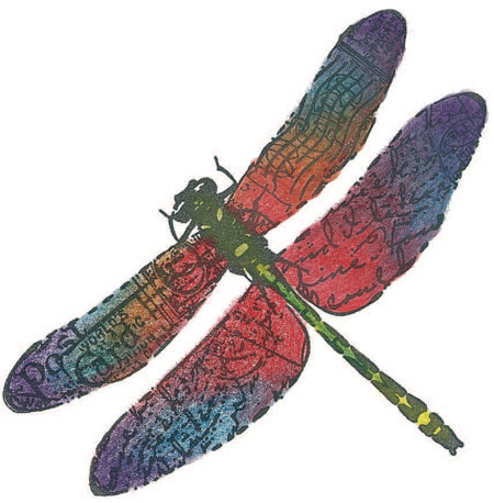
Irojiten Colors
The Irojiten coloring system is simple and unique: all the colors with the same tone are labeled with the same letter. For example, all the vivid tone colors start with a V, pale tones with a P, and so on. This means that even if you place all your pencils into a single cup, you can easily pick out the ones that go together before you start your coloring. Each dragonfly on the right has been colored using colors from the different sets. Each turns out very differently, but the colors all go together within each piece. This makes choosing colors simple, with no mistakes—just use any colors from one set, and they will create pleasant color harmony every time.
Color Harmony
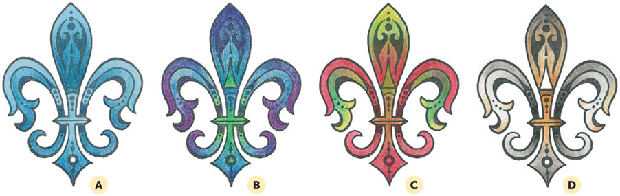
When choosing what colors go together, you can also use some basic color combinations that are harmonious. Here are just a few of the most basic combinations you can use.
A. Monochromatic. Meaning one color, monochromatic combinations use tints or shades of the same hue. This is the easiest color scheme to start with. Here, different blues are used.
B. Adjacent/Analogous. This combination is made from any three colors that are side-by-side on the color wheel. This sample shows violet, blue, and green.
C. Complementary. These are any two colors that are directly opposite one another on the color wheel. Each warm color has a cool color as its complement. Complements create visual excitement and draw your attention. This sample uses reds and greens.
D. Neutral. Black, white, brown, and gray are all neutral colors that work well together.

Colored with a Pale Tone I set.
Colored with Deep Tone I set.

Colored with Vivid Tone set.
To further expand your skills, check out our related tutorials: Blending and Layering Options and Hatching and Crosshatching. These guides offer practical insights and techniques to help you apply color theory effectively. Happy coloring!
Be sure to apply these principles in your projects. For further reading, explore Adobe’s guide to color theory.