
Theory For me, coloring presents the opportunity to explore color palettes without com- mitting to a large project. Thus, I’m willing to make risks I might not take when working on a large quilt or even a painting. And it is usually the mistakes that hap- pen along the way that spur on our most vibrant artistic pieces! A page that you feel is particularly successful might be a great starting point for your next project. Don’t be afraid to take risks! We all have our personal favorite palettes, but some- times incorporating something a little different can really give your work energy and make it sing. I don’t really gravitate toward orange, but frequently it is the little touches of that hue that make my favorite greens and aquas come alive! Strong colors can direct your eyes throughout a piece, and you can use that to your advantage. But what is a “strong color”? Color is, after all, completely contextual, and one color will behave differently depending on the colors that surround it. For instance, a light yellow might recede into the background when placed among or- anges and reds, yet come forward when contrasted with magentas and purples. So it is important to know how to use color to direct viewers’ eyes throughout a piece. The ratio of the colors used will also affect the feeling of a finished piece. Let’s look at some examples.
Color Wheel Basics
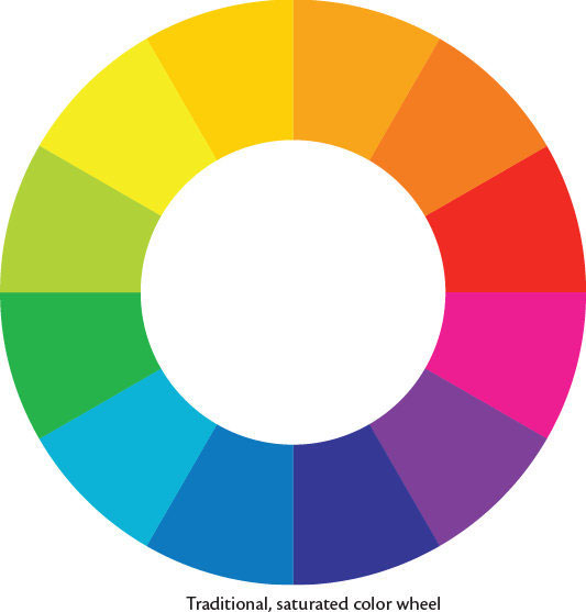
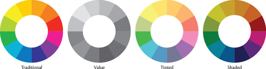
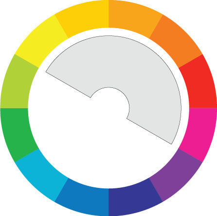
The color wheel contains all the colors, or “hues,” in the rainbow arranged in a cir- cle, so that they flow into each other. The color wheel we are most accustomed to seeing displays pure hues that are deeply saturated.
VALUE
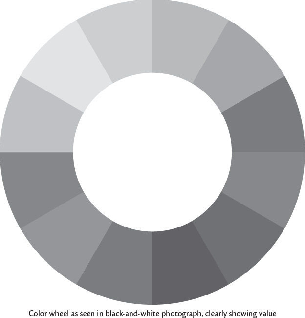
Every color out there has a value, which refers to the brightness of the color. An easy way to conceptualize this is by thinking of the shade of gray each color would produce in a black-and-white photograph. For instance, yellow would appear brighter than blue, so its value is correspondingly higher.
TINTS
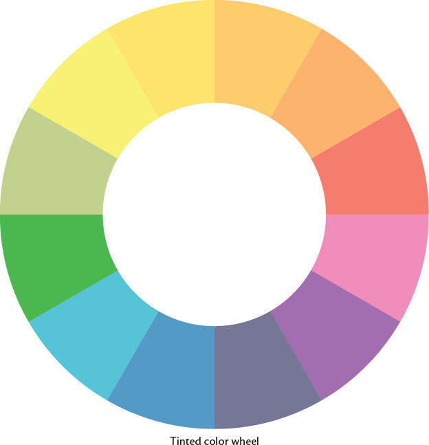
By adding white to the colors on the wheel, we get tints.
SHADES
And by adding black to the colors on the wheel, we get shades. Of course, most colors are actually a mix of hues when you break them down (which is why it is helpful to layer colors when drawing from nature), but for the purposes of this book, when we talk about hue we’ll be referring to the dominant color in question.

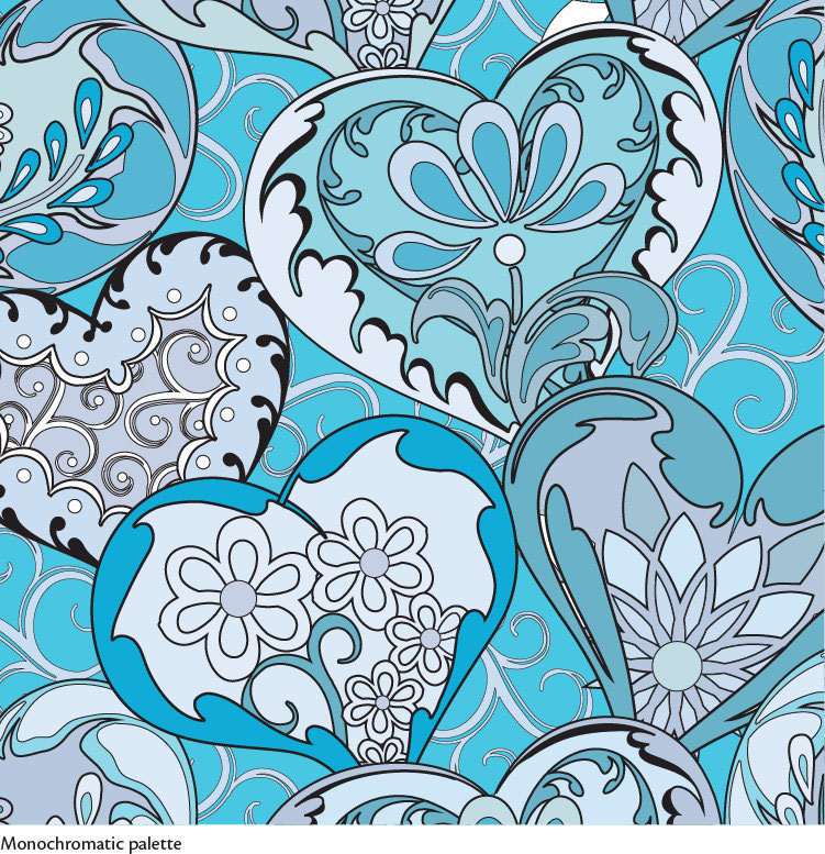
Monochromatic Palettes
First let’s explore monochromatic palettes. Palettes like this are comprised of exclusively one color from the color wheel, although that color’s hue and satu- ration may vary.
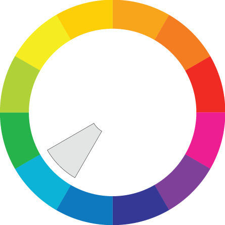
BLUE
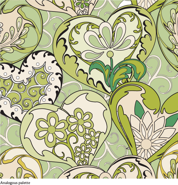
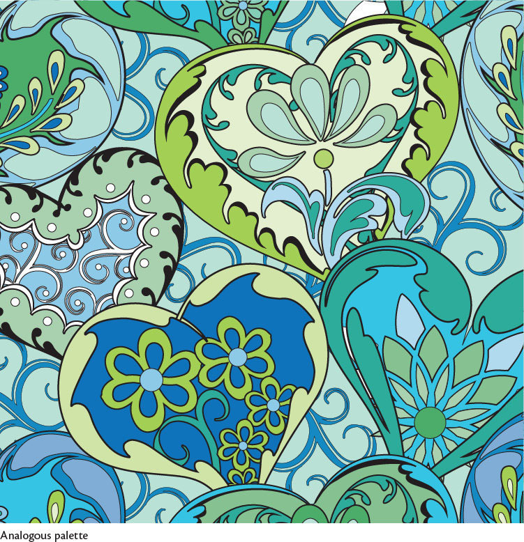
Analogous Palettes
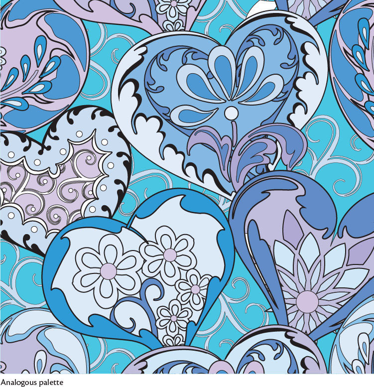
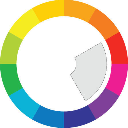
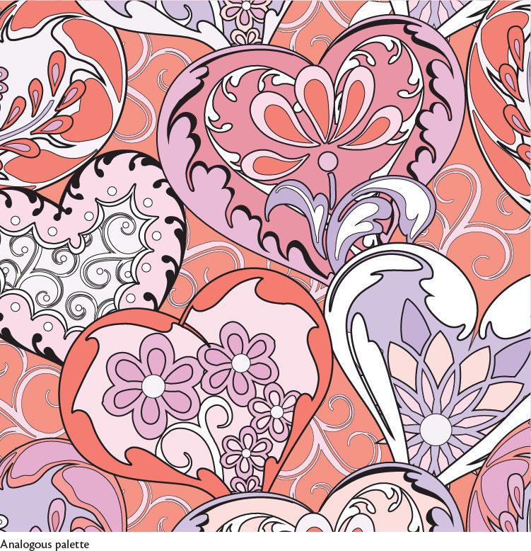
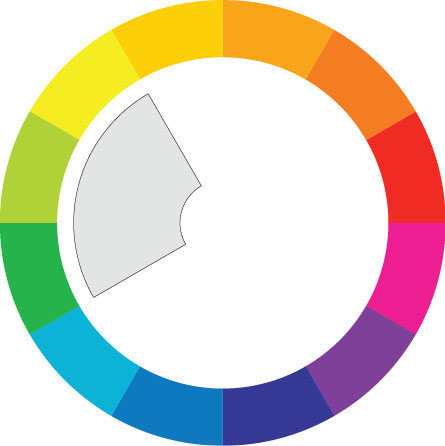
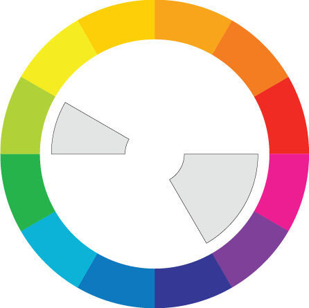
A close relative of the monochromatic palette is the analogous palette. Analogous palettes span two to four adjacent colors on the color wheel. They tend to look restful.
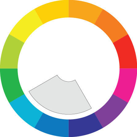
BLUE / BLUE-VIOLET / VIOLET
RED-VIOLET / MAGENTA / RED
YELLOW / YELLOW-GREEN / GREEN
YELLOW-GREEN / GREEN / BLUE / BLUE-VIOLET / VIOLET

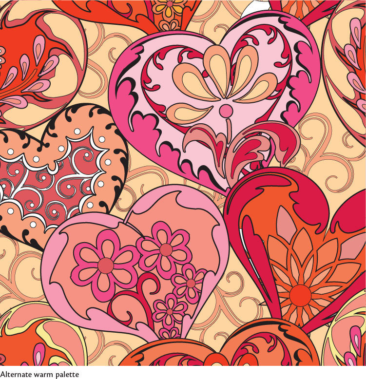
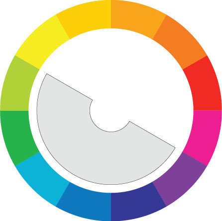
Warm Palettes A warm palette utilizes most of the colors from the warm side of the color wheel.
YELLOW / YELLOW-ORANGE ORANGE / ORANGE-RED / RED / MAGENTA
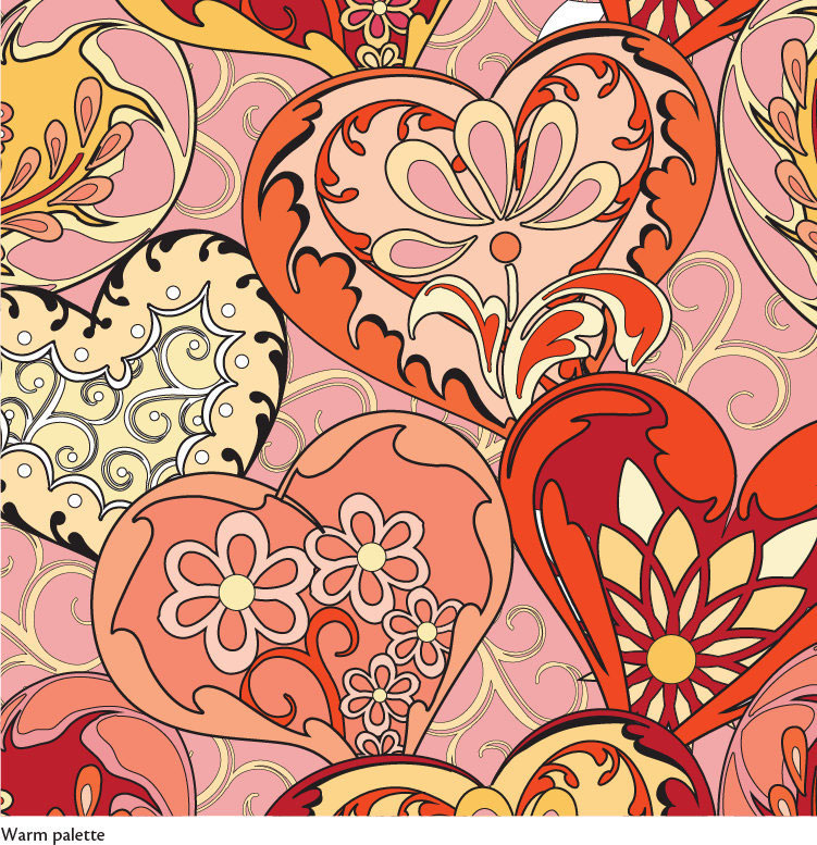
YELLOW / YELLOW-ORANGE / ORANGE ORANGE-RED / RED / MAGENTA

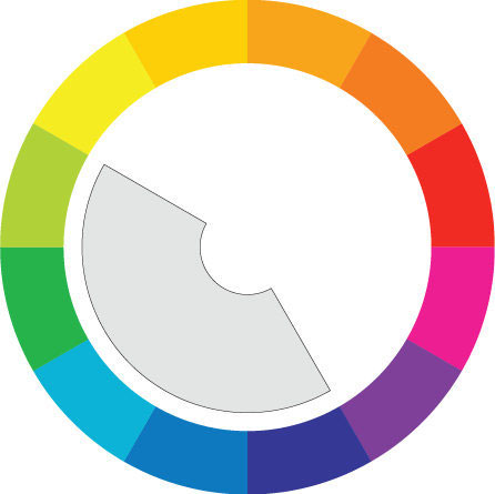
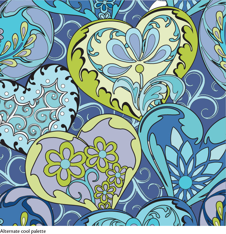
Cool Palettes A cool palette combines most of the colors from the cool side of the color wheel.
YELLOW-GREEN / GREEN BLUE / BLUE-VIOLET / VIOLET / RED-VIOLET
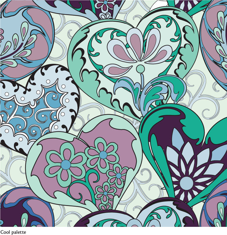
YELLOW-GREEN / GREEN / BLUE BLUE-VIOLET / VIOLET
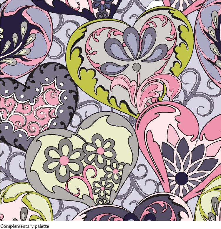
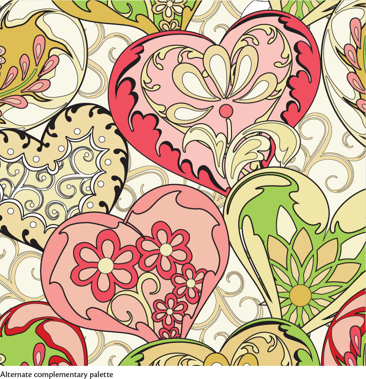
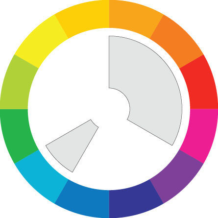
Complementary Palettes
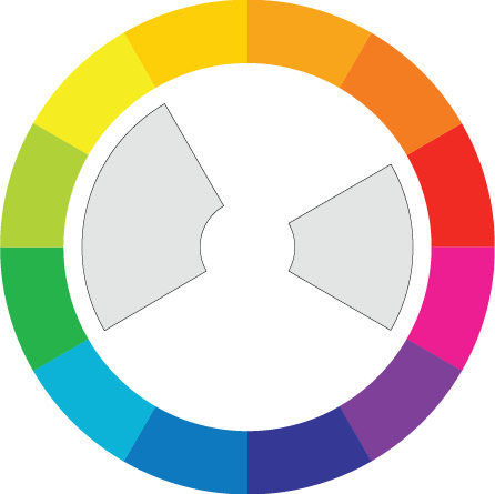
A complementary palette uses colors that are directly opposite (or very close to opposite) from each other on the color wheel in roughly equal proportions. There tends to be a lot of movement and energy in this type of design!
YELLOW-GREEN / RED-VIOLET / MAGENTA
YELLOW / YELLOW-GREEN / GREEN MAGENTA / RED
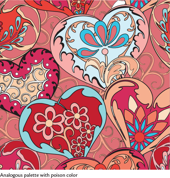
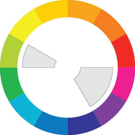
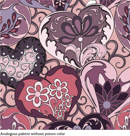
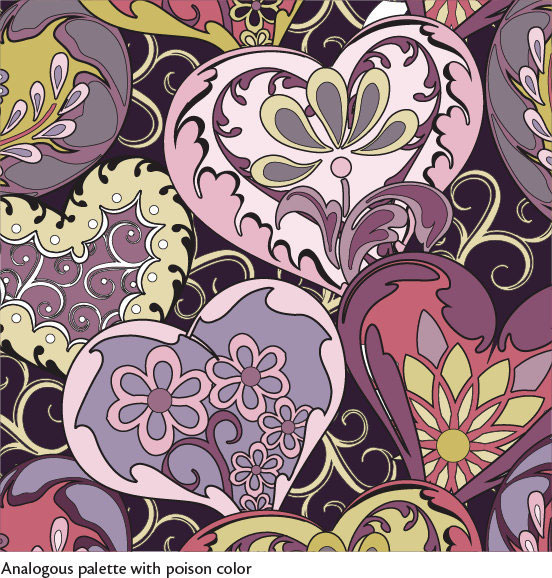
Analogous Palettes with Poison Colors
Closely related to a complementary palette is something I call an analogous palette with a “poison” color. This palette is created when most of the colors in a design are from adjacent parts of the color wheel, but one color stands out because it comes from the area on the opposite side. You can use the outlying color to really direct the viewer’s eye from point to point in the design. It doesn’t matter what that color is; it will draw attention to itself just by virtue of being different. Because of this, poison colors are my favorite!
ORANGE / ORANGE-RED / RED / MAGENTA / BLUE
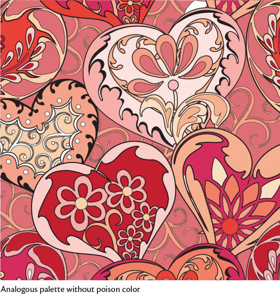
RED-VIOLET / MAGENTA / YELLOW-GREEN
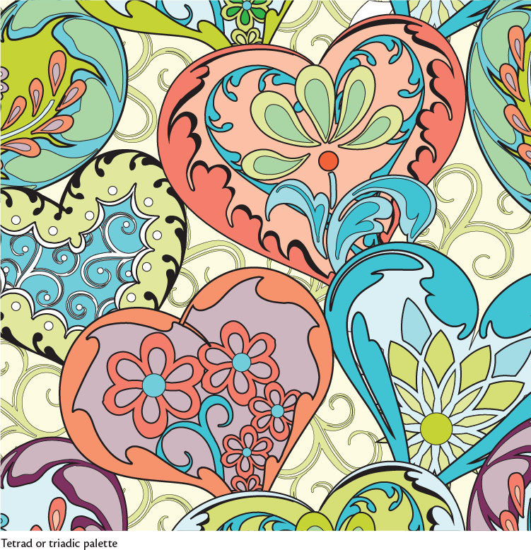
Tetrad or Triadic Palettes
Tetrad or triadic palettes utilize three to four colors from areas fairly evenly spaced around the color wheel. These colors tend to compete with each other. You see these types of colors a lot in modern quilting—usually with lots of negative space to make them pop!
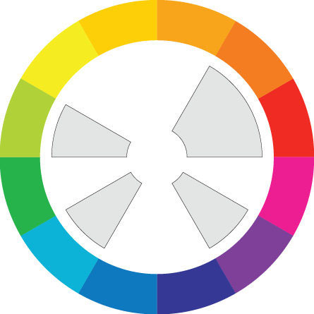
YELLOW-GREEN / BLUE RED-VIOLET / RED / ORANGE-RED