

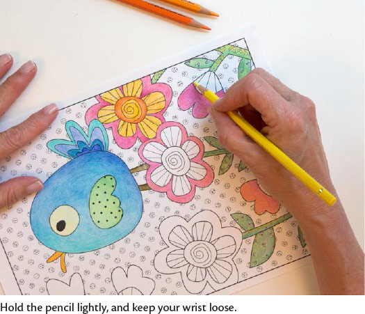
When first starting to color, you may find that your hand hurts because you’re clutching the pencil for dear life! Stop, take a breath, and loosen up.
Hold the pencil with a light grip. Don’t make your fingers do all of the work—let your hand control the movement. Keep your wrist loose so that as you move the pencil over the paper, your whole hand is moving. Paper has texture ranging from smooth to rough.
When you color, pigment from the pencil catches in the texture (the “tooth”) of the paper, which affects the color’s appearance. Most coloring books are printed on smooth paper to ensure smoother colors on the finished page. The more color you lay down on the page, the more colored pencil dust there will be.
Try to keep your hand away from colored areas so that you don’t smear the page. Periodically, use the soft paintbrush to gently brush the dust away. You can also cover parts you aren’t working on with paper to keep them clean.
If you don’t have a brush, canned air can be used to blow away color dust. We don’t recommend blowing it off with your mouth because you might inadvertently blow moisture onto the page.
Laying Down Color
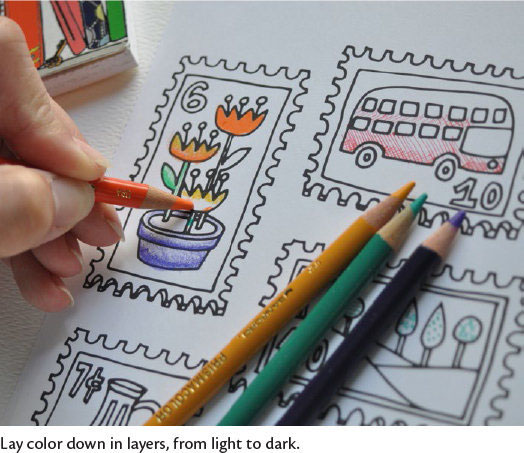
Begin coloring lightly. You can always make a light color darker, but it’s hard to make a dark color lighter. That said, you can use a white artist’s eraser to remove at least some color from the paper.
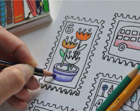
To control the depth of color, change the pressure and angle of your pencil. When you need to place color more precisely, the pencil should be at a steeper angle to the paper. For a softer color, your pencil should be at a flatter angle, closer to the page.
Add color in layers, working from lighter to darker. You can color in more than one direction, and you can change from one color to another, blending colors to make new ones. Don’t feel like you have to use just one color for one section!
Three-Dimensional Coloring
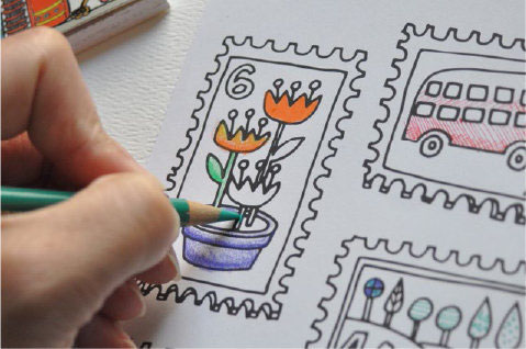
While coloring, you can use a hard treatment to make the entire area the same thickness, but you can also give your illustration some more three-dimensionality by shading in a gradient, like this:
As you can see, I also added a second color for depth. Just choose one direction when you’re coloring, and make all the edges in that direction darker.
With this technique, you can make the entire image seem far more three-dimensional. Here, I darkened the bottom of the green leaf, which is in the same direction as the bottoms of the petals and flower pot.
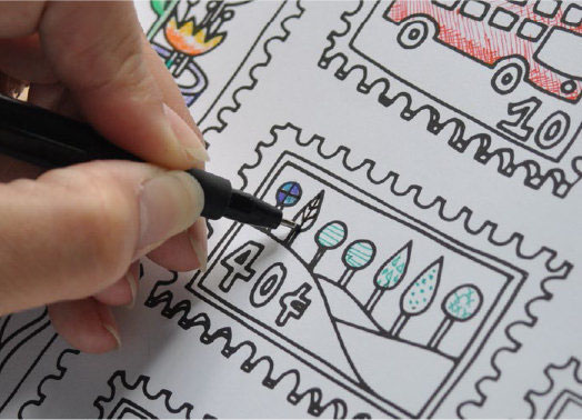
Adding Black
You might color over the black lines of the design, which softens the look of the colored page. To bring back the crispness of the drawing, trace over the black lines with a fine black permanent pen, such as a Pigma pen.
You can draw extra black lines on the drawing as well, to add detail or complexity to the design. Don’t feel limited by the printed lines. You can definitely add to them. By adding more divisions within the illustration, you give yourself more coloring areas, and then you can color those in.
Understanding the mechanics of coloring is crucial for achieving both accuracy and creativity in your artwork. By grasping the fundamentals of how colors interact and the techniques for applying them effectively, you can elevate your coloring skills to new heights.
For further exploration of related topics, check out our internal guides on Color Theory Essentials and Techniques for Blending Colors. To broaden your knowledge, you might also find valuable insights in The Art of Color Theory, which offers a comprehensive overview of how color theory can be applied in various artistic disciplines. Enhance your coloring practice with these resources and bring your artistic visions to life. Happy coloring!